Don’t Doubt Others When It Comes to Publishing a Cover
I was working with my co-author and now that the books have been sent to the editors, there was more work which needed to be done. It’s not hard to write a book but it’s a lot harder to decide on book covers, they covey a powerful message that one would normally not see, being too close to the source. In a way we needed others to have a good look at it, and take some time to think about what it was telling us.
 Our book, which is currently being edited and re-worked, my blogging partner, Sabrina, from Things About Transylvania, and we had three covers to choose from after going through many of them. We also used the method of having people look it over to see if this worked for them or not, so the risk was decreased.
We gave them three choices: one, or two or three and we asked them which one of these should be the cover and why?
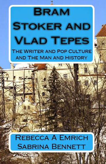
For us, the results were interesting, most people liked the last choice, number three because it gave a good sense of what the book on Transylvania was about. It also reminded them of Bran Castle, and Dracula, which worked for them. It gave them a good grasp of what too look for and what we wanted to show a potential reader. Out of the ten people we asked, nine loved the last one, and one said that number one should be the choice.
 We asked them why not number two: for most people, it was too busy. It looked very much like someone had thrown it together and didn’t want to spend the needed time working on a cover, which probably meant they weren’t keen on trying to write a great book either. This is one of these times when it became important to find out exactly what didn’t work with this cover and what did work. For most people, the blue was a sticking point. We could change it.
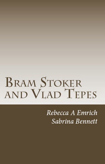
But again, even the option of changing the colour was not something that the beta readers liked. It didn’t covey our message and the focus was on our names and not with the title of the book. Bram Stoker and Vlad Tepes could, and should be the focus.
A cover colour can be changed. That’s not a problem. For others, the majority, the problem was it was too busy, you could not tell what the picture was in the background the cover didn’t show it. They understood it was a castle, and by default it was Bran Castle (aka Dracula’s Castle.) However it was not as clear. and the forest drew attention away from the message.
 The last one is by far the favourite of all of them. It showed the famous landmark, Bran Castle in all of its glory, and had a bit of a wintery feel to it. The front was also much easier to read, and the potential reader can get an idea about it very quickly. The title was the focus and people could see it along with the subtitle and the author names.
What made people like it the most, was it was bold, but also very simple. Most people liked the cover, and liked that it was simple.
When we asked why number one- the cover itself just as simple- wasn’t as liked, someone said to them it was too simple, there was nothing that drew them to the book, the picture in the last one drew them there, and made them want to pick it up and read it.
No matter how we felt about our books, it is important to let someone else have a say. I am pleased with the last cover, and it seems it is the best of the group, but now, we are going to let our readers have their own say on it as well.
So tell us which of these three you like, and why.