Self-Publishing and Visual Illusions
Ready for a magic trick?
It’s the same word count.
It’s all the same font size and font. But the visual look to your book can make or break a book sale. Maybe it’s the way it’s presented, a book is a book, but the size matters. It’s true. Size does matter when it comes to self-publishing, and a standard size will make all the difference to your readers.
A good example is a book sizing. For most non-fiction books, a small size- anything smaller than 5×8 inches, will make the reader feel that it’s too long or it is not as professional as it could be. Most standard non-fiction books are about 5 1/2 x 8 inches or slightly larger. These books aren’t meant to be read through once, they are meant to be held and studied, and generally are referred to again by many of their readers. They need to be durable, and the paper needs to be thick.
A larger book – more than 6 x 9 inches, in non-fiction, is generally viewed as a textbook or a study guide, which is meant to be used for a semester and sometimes referred back to later on in a program of study. I still have a few of my older textbooks, but they are on my shelf so I can go back and feel confident the facts or dates I’ve quoted are correct. I have to take some care not to unintentionally grab one of my many historical-fiction and alternate-universe books from my shelves. The trick is that the fiction books are generally mass market size, and they are thick in comparison.
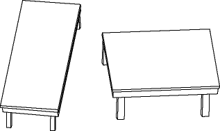
So what does this have to do with visual illusions? My own book, when printed on an 8 x 11 inch sheet of paper seems thinner and shorter than the actual 5.5 x 8.5 inch book. It looks like a normal book when it’s placed next to some of my other history books. It is the same book, with the same word count and the same interior, just not folded in half. The only difference is the size of the book itself and it can fool most people into believing they are getting a bigger book. Both sizes are industry standard, but the visual illusion played is powerful.
 Another visual illusion that goes on is seeing what you want to see before your book comes out. It’s easy to get caught up in the details. It’s even easier to not give yourself enough space to realize you have to go back and look at it another way. My co-author and I have spent the better part of 2014 writing and re-writing our book on blogging and writing a blog. It looked visually appealing, and it looked professional and it looked fantastic. There was one glaring mistake with it that neither one of us noted until we took the time to step back and really see what was wrong. On the front cover, our names are placed in order of myself, and her. On the copyright notice, it’s reversed, once again on the title page, it’s back to the cover page. This might not mean much, most readers wouldn’t pay terribly much attention to how the authors names are placed, but it does make it visually different- and for those who notice, a mark of a mistake prone writer- and over time this will hurt your book sales.
Fortunately, it was because we hit December and both of our writing lives got put on hold. With the space we had, we were able to see the mistakes for what they were, mistakes. The illusion of minor change really isn’t minor, it’s about professional standards, and a lot of seeing hidden gems of errors on the page. Illusions are something most writers are fooled by, and it is even more true when it is a self-published book- we can’t see our mistakes right away, and we don’t think as much about standards as we should. Working with illusions based on size is one thing, working and publishing something that’s not well done is another.
The key to success is avoid illusions and know the standards.
The Redcoats are Coming!


One Comment
Amy
visually it's the size for me. Otherwise I don't care about the price.